Brand Archive
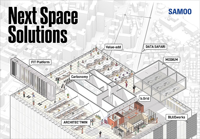
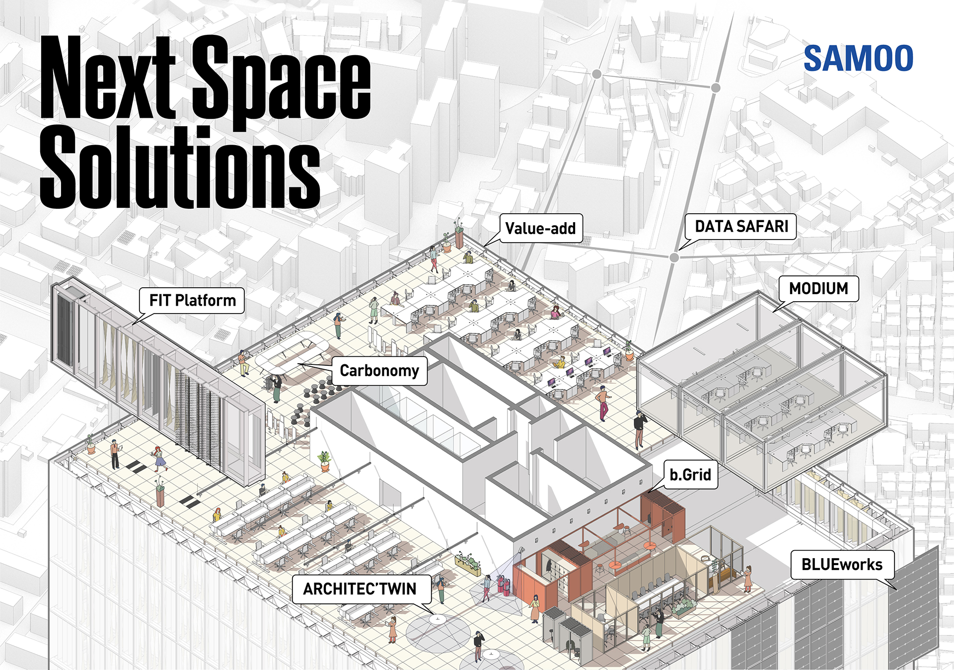
Next Space Solution
We deliver tailored solutions that maximize our clients' asset value through SAMOO's distinctive approach to the architecture of the future.
-
SAMOO is in the spaces that fill your everyday life | SAMOO 50th Anniversary Billboard Film (15s)
-
SAMOO Brand Film (ANSWER UNASKED)
-
Borderless Challenge, The Innovation Leader | 2024 SAMOO A&E Brand Film
Design Concept
The SAMOO CI is designed as a concise logotype capable of adapting to a variety of media.
The distinctively elongated typeface represents boundless possibility and freedom that transcends borders.
The bold yet solid typeface reflects SAMOO's commitment to being a trusted company and its firm resolve to pursue perfection as a group of experts. SAMOO Blue, the primary color of the CI, represents SAMOO's spirit of challenge toward innovation in future architecture and symbolizes the creativity to realize it.
CI & Slogan
Primary Logo

Sub-Brands
SAMOO ARCHITECTS & ENGINEERS

Color Palette
Primary Color
PRIMARY
SAMOO Blue
PANTONE 286C
C:100 M:80 Y:0 K:0
On-screen
R:20 G:40 B:160
HEX: #1428A
White
Use white space effectively.
Neutral Colors
NEUTRALS
Gold
PANTONE 872C
C:20 M:30 Y:70 K:15
On-screen
R:164 G:134 B:69
HEX: #A48645
Silver
PANTONE 877C
C:0 M:0 Y:0 K:40
On-screen
R:151 G:153 B:156
HEX: #97999C
Point Color
POINT
Point Blue
PANTONE 2174C
C:70 M:30 Y:5 K:0
On-screen
R:0 G:127 B:255
HEX: #007FFF